

That's a turbo laser! And what a stupid name that is by the way. Turbo-laser destructor. It almost beats bloodstrike missile. Almost. I mean what does it mean? That the laser is turbo charged? That the laser is faster... than the speed... of... light... no, that can't be it. So is it firing faster? Is that the turbo? But turbo is all about forcing gas into a smaller space to get more power. And what about the third element? Destructor? Sounds like it is destroying the turbo-laser. Enough. The name is stupid but it has hung around since Adeptus Titanicus so I think I can forgive it. Now, "why does this demonstrate colour theory Jeff?" I hear you ask, well, at the moment it doesn't. Consider, however the following picture.

Now compare the weapon on the left with the one on the right. On the left it looks like a toy, the colours look awkward somehow. Why? Because if I had left it there I had broken colour theory. Lets go to the wheel:

The picture on the left uses adjacent colours on the wheel. There is no contrast, and precious little complement. The addition of the brass/bronze gives the opposing colour creating a split complimentary scheme. More on this here. Essentially the message to take home is to think through the scheme before you start as you can run into problems later. In this case I had instinctually known that green would work in the scheme (I've been doing this a while) but by the time I got to the picture on the left I was starting to worry that I had made a mistake. It just didn't work. A quick glance up at the colour wheel on my wall keeping the overall plan in mind reassured me. Once the orange/brown metallic shade was in place the blue and green would be complimented. If I didn't have this knowledge and the tool of the colour wheel then I might have changed course mid way through wasting time and possibly having a worse finish at the end. Lesson learned.
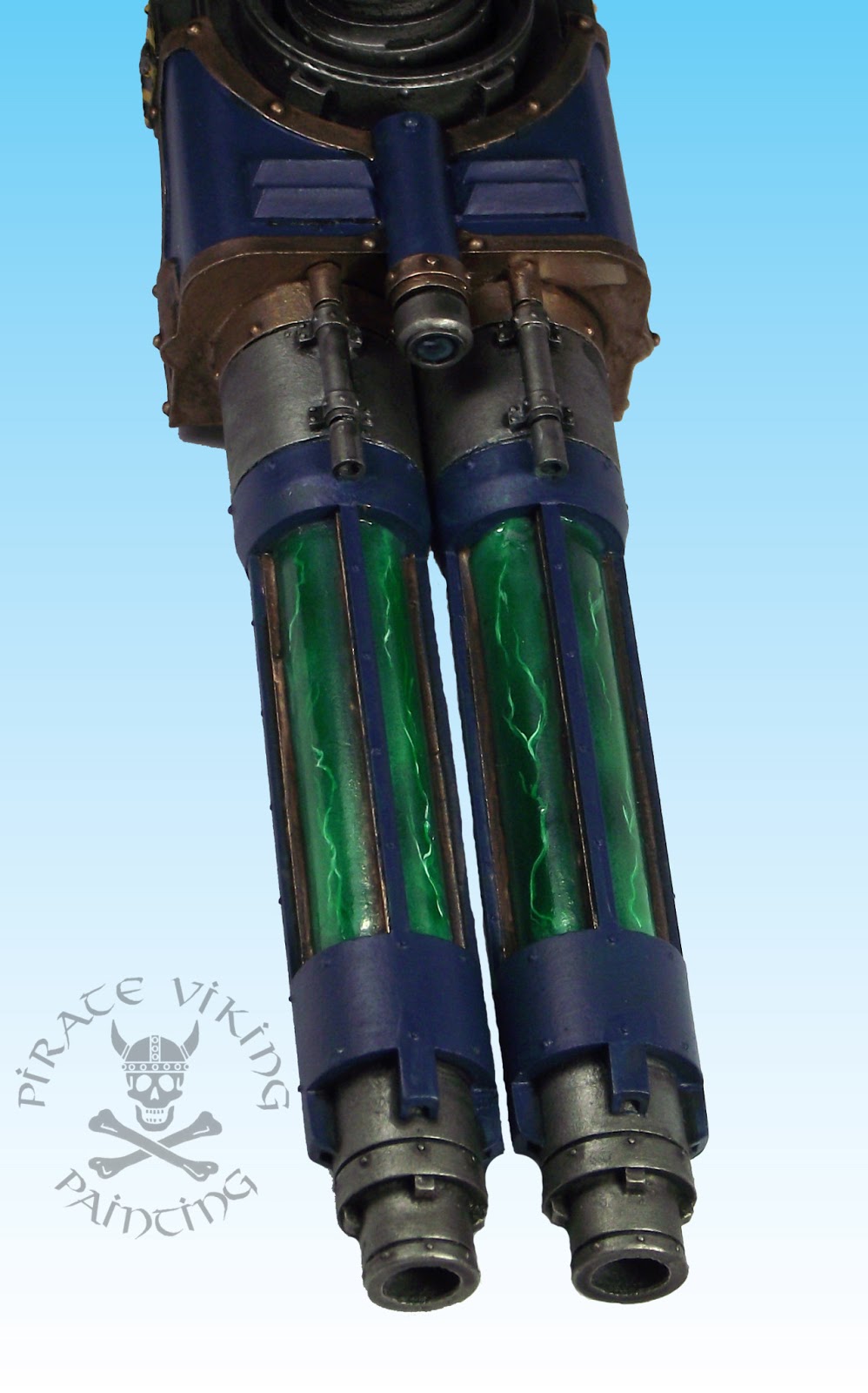
While we are talking about this I should mention the green! While musing on the colour scheme for this weapon I had done my usual internet meanderings and had found this on Spikey Bits. I liked the idea of not having just plain steel tubes running through the middle but thought that the linked example was a little too cartoony for me and didn't serve to explain how the weapon worked. It was just lightning for lightning's sake. For Pyladii Alpha I figured that making the tubes look like they contained some sort of highly charged plasma cloud, I picture it flashing into light when the weapon fires. Yeah, I know the physics doesn't exactly stack up but there you go! To achieve this I first airbrushed a series of different diffuse clouds in white over the black undercoat to achieve a greyscale cloudy effect. Then I painted white lighting on it fading out at either end to indicate that it was simply passing out of sight rather than petering out. Then I airbrushed green ink over the result and left it to dry. Inks are perfectly translucent and thus simply tint the greyscale below and are therefore perfect for this role. I repainted the brightest areas of the lightning in white and resprayed with green ink. A thin coat of water effects finished the deal. More titan stuff after the weekend folks!
TTFN
That means my Alpha Legion have a split complementary scheme (the same one, even) without me even realising. Gosh.
ReplyDelete